
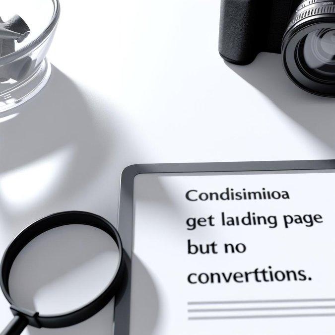
Your landing page is getting clicks, so why isn’t it getting customers? Traffic without conversions is not a marketing win-it is proof that something is breaking between attention and action.
In most cases, the problem is not the ad budget, the traffic source, or even the product. It is the page itself: the message is unclear, the offer feels weak, or the next step asks for too much too soon.
A landing page can fail in seconds if visitors do not instantly understand what they are getting, why it matters, and what to do next. Small points of friction-slow load times, vague headlines, weak proof, confusing forms-quietly destroy conversion rates.
This article breaks down the real reasons landing pages underperform and shows how to fix them with practical, high-impact changes. If people are arriving but not converting, you do not need more traffic-you need fewer leaks.
Why Landing Pages Lose Conversions: Diagnosing Message Match, Offer Clarity, and User Intent
Most landing pages do not fail because they are ugly. They fail because the visitor arrives expecting one thing and sees another. If the ad promises “bookkeeping for Shopify stores,” but the page headline says “modern finance solutions for growing brands,” that is not a branding issue; it is a message-match leak, and it shows up fast in Google Ads search term reports, session recordings in Hotjar, and high bounce from paid traffic only.
Offer clarity is a separate problem, and teams often blur the two. A page can match the click perfectly yet still underperform because the user cannot tell what happens next, what is included, or whether the offer is for them. I see this constantly with SaaS demos: the button says “Get Started,” the form asks for a company size, and nowhere does the page explain whether the user is booking a call, entering a trial, or requesting a quote. That hesitation is expensive.
Then there is intent. Quietly, this is where many pages break. A visitor searching “best CRM for real estate teams” is still comparing options; sending them to a hard-close “Book a Sales Demo” page ignores buying stage, even if the copy is strong.
- Message match: compare keyword, ad copy, headline, and CTA in one sheet; any shift in language usually means drop-off.
- Offer clarity: ask five people internally to describe the offer in one sentence; if answers vary, the page is muddy.
- User intent: segment traffic by query type in GA4; informational visitors need proof and orientation before commitment.
One quick observation: founders love clever copy more than buyers do. Buyers scan for relevance, risk, and next step. If those are unclear, more traffic just means you are paying to scale confusion.
How to Fix a Landing Page That Gets Traffic but No Sales: Copy, CTA, Form, and UX Improvements
Getting clicks but not sales usually means the page is forcing visitors to do extra mental work. Tighten the copy first: your headline should name the outcome, not the feature set, and the first screen should answer three things fast-what this is, who it helps, and why this version is safer or easier than alternatives. In audits, I often see strong traffic from paid search landing on copy that reads like a homepage; that mismatch kills momentum.
- Rewrite CTAs to match buying intent: “Get My Quote,” “Book the Demo,” or “See Pricing” almost always outperform vague buttons like “Submit” or “Learn More.”
- Strip form fields until each one earns its place; if sales only needs name, email, and company, don’t ask for phone, team size, budget, and timeline upfront.
- Use one visual hierarchy path: headline, proof, CTA, objection handling. Heatmaps in Hotjar or session recordings in Microsoft Clarity will show where attention breaks.
A quick real-world fix: a B2B software page was sending paid traffic to a form that asked for seven fields before showing availability. We moved pricing guidance and a client logo row above the fold, cut the form to three fields, and changed the button from “Contact Us” to “Check Availability.” That kind of change doesn’t feel dramatic. It often is.
One more thing: UX problems hide in small frictions. A sticky mobile keyboard covering the CTA, a coupon box that invites hesitation, a slow-loading testimonial slider-these are conversion leaks, not design details. If you use Google Optimize alternatives like VWO or Optimizely, test one friction point at a time, or you won’t know what actually fixed the page.
Advanced Landing Page Conversion Optimization: A/B Testing, Heatmaps, and High-Impact Mistakes to Avoid
Once the obvious friction is fixed, optimization stops being about “best practices” and starts being about evidence. A/B testing only works when the variable is isolated and the success metric matches the page’s job; testing a headline, form length, and CTA color at once usually tells you nothing. In practice, teams get better results by testing one decision layer at a time-message first, trust elements second, interaction details last-using tools like VWO, Optimizely, or Google Analytics 4 to validate actual behavior, not opinions.
Heatmaps from Hotjar or Microsoft Clarity are useful, but mostly for diagnosing attention leaks, not proving causation. If visitors rage-click a non-clickable pricing badge, stall before a long testimonial block, or never reach the form on mobile, that is directionally valuable; it tells you where to investigate next. I’ve seen SaaS pages gain conversions after moving the pricing reassurance above a sticky mobile CTA-not because the button changed, but because hesitation got answered earlier.
One quick observation: internal teams often test what is easiest to change in the CMS, not what creates doubt for the buyer. That’s expensive.
- Do not call a test too early; weekday traffic and paid campaign shifts can distort results fast.
- Avoid optimizing for click-through if lead quality drops after handoff to sales.
- Never trust aggregate data alone; desktop winners often lose on mobile.
The highest-impact mistake is solving for surface metrics while the conversion path stays misaligned. If scroll depth looks strong but form completion remains weak, the issue may be commitment timing, field anxiety, or unclear next-step expectations. Test around those points, or you will spend weeks “improving” a page that still cannot close intent.
Summary of Recommendations
Traffic without conversions is rarely a volume problem-it’s a clarity and trust problem. If visitors are arriving but not acting, the right move is not to chase more clicks, but to remove the friction that makes the next step feel uncertain, irrelevant, or risky.
- Start with the biggest drop-off point instead of changing everything at once.
- Match message, offer, and audience intent before investing more in paid traffic.
- Treat testing as a decision tool, not a guessing exercise.
The best landing pages do one thing exceptionally well: they make the decision to convert feel obvious. Fix that, and traffic starts turning into revenue.

Dr. Ethan Caldwell is a specialist in Digital Performance and Web Engineering, with a Ph.D. in Computer Science focused on scalable web systems and high-performance architectures. Over the past decade, he has worked with global startups and enterprise-level companies, helping them optimize digital infrastructure, improve conversion rates, and build data-driven growth systems.
His expertise spans conversion rate optimization (CRO), performance engineering, UX optimization, and full-funnel strategy, combining technical precision with business impact. Dr. Caldwell is known for transforming underperforming digital assets into high-converting, scalable platforms.
He regularly publishes insights on web performance, user behavior, and growth engineering, focusing on practical strategies that drive measurable results. His work is grounded in real-world experimentation, A/B testing, and continuous optimization.